Nearly anyone can get a website up and running with ease these days. It’s awesome. But just because your website is live, doesn’t mean that your design is optimized.
Why does design matter? It only takes 0.05 seconds for people to form an opinion about your website. Yes, you read that correctly — 50 milliseconds. Most of that opinion is coming from the design.
The design also impacts your conversions, credibility, and ultimately makes or breaks the success of your site. No website is perfect, but your goal should be to make your website as optimized as possible.
Here’s something to take into consideration as well: 94% of negative feedback about websites is design related and 38% of users will stop engaging with a website that has an unattractive layout. After a bad experience, 88% of consumers are unlikely to return to a website. That’s almost everyone. So, if your web design isn’t optimized for UX, it’s going to be detrimental to your success.
On the flip side, well-designed websites thrive. Visitors are more likely to convert, enjoy their experiences, and keep coming back in the future. I saw a recent study that 77% of agencies say that a poor website design is the most significant weakness of their clients. That’s what inspired me to write this guide.
Lots of factors go into designing a website. These are the thirteen most important elements to prioritize in 2019. If you follow these best practices, the performance of your site will drastically improve.
1. Minimize text
Stop filling your pages with so much text.
Obviously, if you’re writing a blog post, there will be tons of text on the page — that’s not what I’m talking about here. I’m talking about the number of words on your homepage and your landing pages. There should be very minimal text on those pages. This is a major problem I see when I’m analyzing websites.
Sure, you’ve got a lot to say. You want to tell your website visitors all about you, your company, your brand, and your products. That’s fine. You simply need to learn how to tell that story in just a few sentences — or even better, just a few words.
2. Show, don’t tell
Visuals not only help you break up the written content, but they can also provide a deeper explanation without the use of text. Instead of explaining things to your website visitors, you can simply show them. They’ll understand more completely in a shorter amount of time.
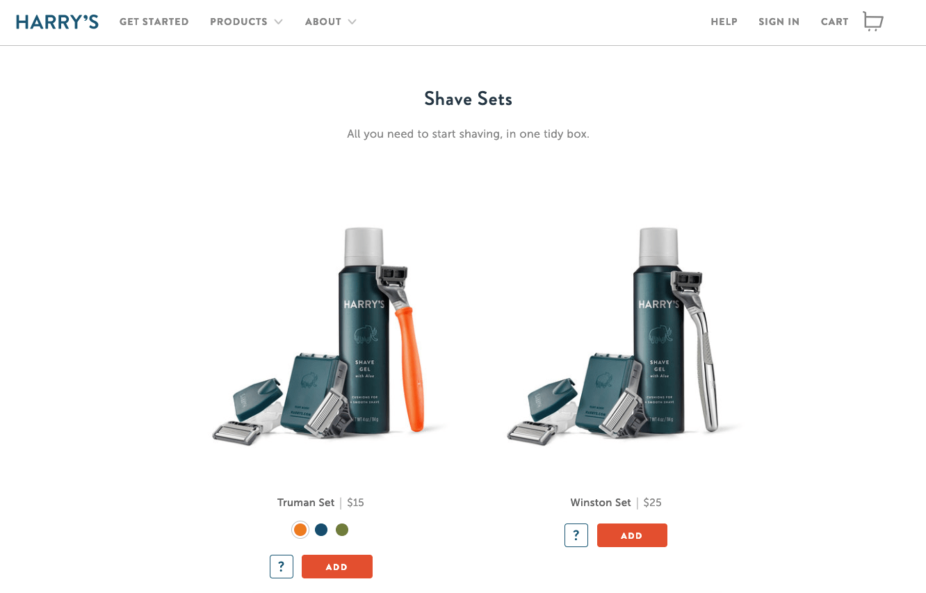
Harry’s product page embodies both of these first two design principles:

For example, let’s say your website sells razors, blades, shaving cream, and other shaving products for men. You operate on a subscription business model and deliver these products to your customers on a monthly basis. The design of your razors is very handsome — they’re made of carved hardwood and are nice enough to give as a gift.
Rather than going into all of this detail on your homepage, you can simply have a photo of these products with text saying something like, “delivered to your door.” You get your message across in just four words. Sure, you can go into greater detail the deeper the visitor gets into your pages, but a lengthy text description isn’t required.
3. Use short sentences
Short sentences are easier to read.
If you bombard visitors with text all over the screen — and make those sentences hard to read, they won’t know where to start reading and won’t be able to digest your content.
Mix it up. If you need a long sentence, follow it with a short one. Variety helps.
4. Try shorter paragraphs
Use paragraph breaks to your advantage. It’s okay to write longer paragraphs, but I like to keep my homepage paragraphs to a few sentences.
Start each paragraph with the new information, so if someone is scrolling they can quickly tell if they need to read that paragraph.
Eliminating unnecessary text on your pages reduces clutter and gives you more room to put emphasis on your call-to-action.
5. Make your CTA clear and obvious
CTAs should not be buried. They need to be big, bold, powerful, and clearly stand out as the action your visitors should take next.
Only 47% of websites have a CTA button that can be spotted in less than three seconds. So there’s a coin flip chance that you fall into the group that takes longer. That’s not the category you want to be in. You can’t drive conversions without an effective CTA button.
Here’s something else to consider: 72% of businesses don’t have a CTA on their interior pages. This is a major design flaw. You can’t expect visitors to navigate back to your homepage to convert.
Take a look at this CTA from Litmus.

Look how simple this design is. There is minimal text on the screen, so the message is clear.
As a result, the CTA “sign up free” stands out. In fact, Litmus even put it in more than one location on the screen.
6. Reinforce actions with familiarity
If your message is the same, your CTA should be the same. On every single page.
Think about how people navigate on your website — even if you set up a certain flow, not everyone will land on a page and convert in seconds. They may browse around for a bit first.
For example, let’s say you have an ecommerce website. You shouldn’t change the CTA button from page to page, which would look like this:
- Homepage: Checkout now
- Category page: Buy it today
- Product page: Click to purchase
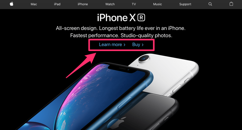
If a visitor sees one of those buttons on your homepage, the other on a category page, and the third on a product page, there’s no reinforcement. Instead, follow the example of a global leader like Apple. This is what the Apple homepage looks like:

Right away you can see that it’s very simple. There is limited text on the screen, and it has one featured product in view.
The product has a title, a quick snippet description, followed by two options.
That’s it.
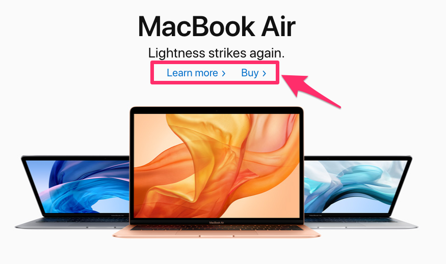
Now let’s see what happens when we continue scrolling.

This is the exact same format, but for another product.
After some limited text, we are offered the same two buttons, positioned in the same location above the image. Again, this is still on the homepage.
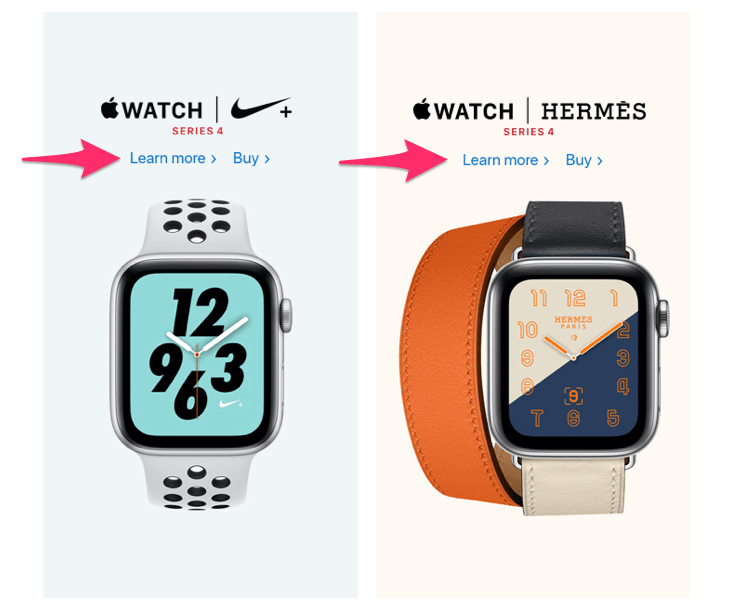
Just for good measure, let’s navigate away from the homepage to a product page to see if this pattern continues.

The watch page has the same pattern. This is consistent on every page, for every product. That’s how you reinforce actions with familiarity.
You need to apply this design principle to your website as well. It goes beyond the CTA button. The idea is to have this type of reinforcement with as many elements as possible.
7. Simplify the navigation
It shouldn’t be difficult for a website visitor to find what they’re looking for on your site.
Take a moment to put yourself in their shoes. They are browsing on your website for a reason. Maybe they want to buy something, get more information, or see what you have to offer. Whatever that reason may be, if they can’t figure it out quickly, they’re going to leave.
There is just too much competition out there. Users have no reason to put up with complex website navigation. All they need to do is leave your site and find what they need somewhere else.
Don’t try to reinvent the wheel with a complex design. Stick with the standard format.
For example, 88% of websites have the main navigation menu positioned horizontally at the top of each page. If your menu is somewhere else, it’s going to confuse your visitors.
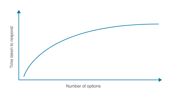
Let’s continue talking about the menu since it’s a major navigation gateway. The fewer options in the menu, the better. Otherwise, it will be too hard for people to find what they need. This concept is known as Hick’s Law.

The more options you give someone, the longer it will take them to make a decision. That’s why complex designs and navigations will crush your conversion rates.
There’s a famous experiment about this, referred to as the jam study, which discusses the paradox of choice.
The experiment was conducted at a local grocery store. Consumers were presented with 24 jams to sample on one day, and 6 jams on the following day. The larger display on day one attracted 60% of shoppers, but only 3% of those people made a purchase. The smaller display of 6 jams on the second day attracted 40% of shoppers, but 30% of them made a purchase.
By limiting choices, conversions were ten times higher. This same concept can be applied to your website navigation.
Find ways to eliminate unnecessary menu options. For example, instead of having a “home” button, just use the website logo to link back to the home screen.
Take a look Square’s homepage.

The design is super clean. The menu options are extremely limited. This makes it easy for visitors to choose a selection that fits their needs.
I chose this example because it also follows the web design best practices that we already discussed. There is minimal text on the screen, and the CTA is clear and obvious.
This type of design makes it nearly impossible for website visitors to get lost or confused when they’re navigating.
For those of you who have lots of options on your website, such as an ecommerce shop, you can add a search bar to simplify the navigation process without using a complicated menu.
8. Optimize your design for mobile devices
According to Alexa rankings, 80% of the top websites are optimized for mobile devices. That’s because mobile browsing is becoming the new normal.
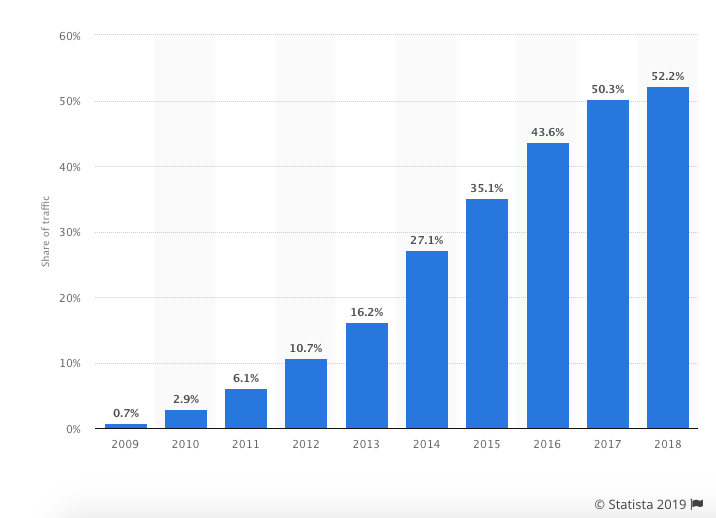
Just look at these trends from Statista.

More than half of the web pages worldwide are served to mobile phones. Mobile Internet traffic has officially surpassed desktop usage. That trend is continuing to rise.
Here’s something else to consider. 57% of people won’t recommend a business to others if that company has a mobile site that’s poorly designed. Getting your customers to recommend your brand to others is definitely something you need to prioritize.
94% of people will judge a website based on a responsive design. So if elements of your website design aren’t responsive, they need to be fixed or eliminated immediately.
A mobile-optimized website is not only essential for the user experience, but it’s important for SEO purposes as well.
Search engines recognize this and reward sites that are mobile friendly. Google knows that 87% of smartphone owners use their devices to run an Internet search at least once per day. The result: 70% of the first page results on Google are optimized for mobile devices.
9. Prioritize SEO
We briefly touched on this subject earlier when we talked about mobile-friendly websites. But everything you do on your site needs to circle back to SEO.
93% of all Internet experiences start with a search engine. So your SEO strategy must go far beyond just adding keywords to your blog posts.
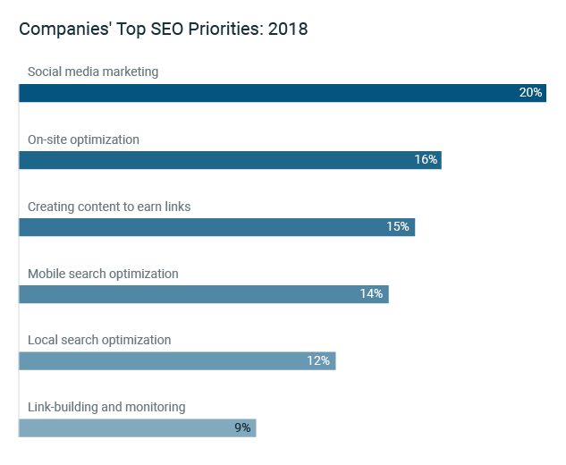
Failure to focus on SEO will put you at a disadvantage to your competitors. Last year, these were the top SEO priorities for businesses.

As you can see, on-site optimization ranked second on the list. This is related to web design. So take a look at your on-page elements.
Create an XML sitemap. This will make it easier for search engine crawlers to analyze content on your website. A sitemap will show the bots the location of pages on your site, when the page was last updated, the updating frequency, and the relationship to other pages on your site.
A proper sitemap shows Google that you don’t have duplicate content, which can damage your SEO rankings.
When you’re designing your site, you need to make sure that the architecture has a logical hierarchy as well.
10. Monitor your page loading speed
I know what some of you are thinking. What does page loading speed have to do with web design? Everything.
Sure, loading times are related to your website hosting plan, server, traffic, and things of that nature. However, design choices can impact your loading times as well.
Each time you add an element to your site, especially images, videos, and other complex media files, your loading times can be affected.
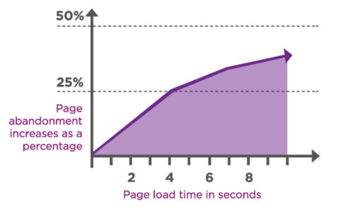
Slow loading times lead to high abandonment rates. You can’t ignore this. If your pages take too long to load, it’s going to be a huge problem.

Furthermore, 40% of people abandon websites that take more than three seconds to load. Yes, three seconds. That’s all you have, or you’ll lose 40 out of every 100 visitors.
And three seconds isn’t always good enough — 46% of people expect pages to load in two seconds or less.
So how can you apply this to your web design?
- Reduce the file sizes of your images.
- Take advantage of browser caching tools.
- Reduce HTTP requests.
- Improve your TTFB (time to first byte).
- Minify and combine your files.
There are lots of tools available online to help you accomplish these things. For example, check out the WordPress Rocket plugin as a resource for minifying and combining your files. Use the Page Speed Insights tool from Google to help you monitor your loading times whenever you make design changes on your website.
11. Choose a color scheme that fits your branding strategy
The color choices you make on your website are more important than you think.
Studies show that products are judged in less than 90 seconds. Your website can be considered as a product. 90% of that judgment is based solely on colors.
The best way to choose your website color scheme is with branding. Refer to your logo. Do the colors on your website fit with your brand image?
Research shows that colors can increase brand recognition by up to 80%.
Here’s an example. Think of Starbucks.
When you hear this brand name, I’m sure you have an image in your head. Maybe it’s the logo, a sign, or a store location.
Do you associate any colors with that name? Now let’s look at their website.

It’s no surprise that they went with a green color scheme.
This design choice matches their logo and brand image, which reinforces what consumers already associate with the brand. By keeping things consistent, there is no confusion. It would be odd if you visited this website and the colors were yellow and red. That has nothing to do with their brand.
We’ll talk more about reinforcement in greater depth as we continue.
12. Continuously run A/B tests
When it comes to your website design, you can’t just set it and forget it.
As I said earlier, no website is perfect. There are always ways for you to improve your design.
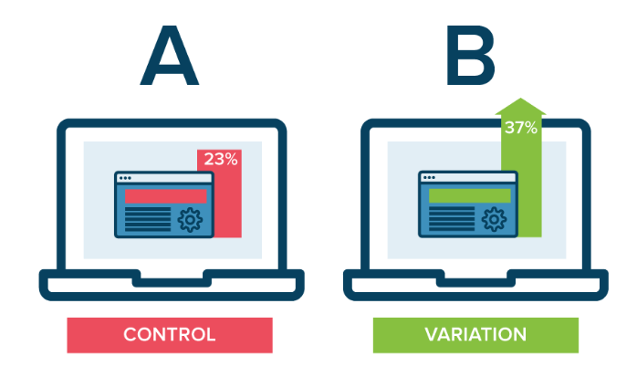
That’s why you need to run A/B tests.

Nearly every element of your site design can be tested.
Here are some quick suggestions to get you started in the right direction:
- Test the location of your CTA button
- Test the color of your CTA button
- Test the CTA copy
- Test the images that you’re using on landing pages
- Test wording variations of text on the screen
- Test the size of your navigation bar
There are so many options, I could spend all day talking about this. For those of you who aren’t familiar with A/B tests or need some help, check out my guide on everything you need to know before you start A/B testing.
13. Use bullets
Instead of adding paragraphs and long-form writing, consider using lists. In those lists, use bullet points.

Studies show that more people will look at lists with bullet points than other formats.
Conclusion
Saying that the design of a website is important would be an understatement. Your web design choices will ultimately impact whether or not your site is successful.
- Everyone’s website can be improved. Use this list as a guide as a resource to help you make those improvements.
- Don’t get overwhelmed. I’m not saying you need to implement all of these design suggestions overnight, but you need to start somewhere.
- I didn’t pull these ideas out of thin air. Everything on this list is backed by research and statistics related to design principles.
It doesn’t matter if your website is brand new or if it’s been around for a decade. These are the web design best practices that you need to follow in 2019.

Source Quick Sprout https://ift.tt/2C165WP

