Every website can benefit from signup forms.
Depending on your business, these forms may vary greatly in their design and purpose.
Some of you are using signup forms to simply collect email addresses for your subscriber lists. Opt-in forms are great for your lead generation strategy.
Other companies rely on signup forms to acquire new customers. Subscription-based businesses need signup forms to generate revenue.
Signup forms improve communication between you and your current or prospective customers. They also allow you to share more information about your company while gaining insight into people who sign up.
Regardless of what you’re using signup forms for on your website, they are useless if your website traffic isn’t converting.
Unlike other customer acquisition strategies you’re probably using, creating a signup form isn’t expensive.
All you need to do is implement some minor changes to your website. Typically, these forms can be updated and embedded in just minutes.
You already spent much time, effort, and money getting visitors to land on your website. Don’t let those efforts go to waste by not improving your conversion efficiency.
This guide is perfect for anyone using signup forms with underperforming conversion rates. It will also help those building new signup forms.
After you review the tips I’ve outlined on this list, you’ll be able to generate more leads, improve conversions, and ultimately increase revenue.
1. Reduce the number of form fields
People are busy. They have better things to do than spend all day on your website.
To get them to convert, you need to make your signup forms as short as possible.
If these forms are long and require too much information to complete, people won’t take the time to fill them out. In fact, studies show that fewer form fields have the highest conversion rates:
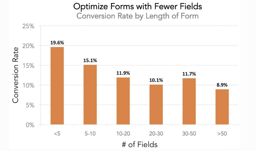
Forms with fewer than five fields convert at a rate of nearly 20%.
If you currently have signup forms with six or seven fields, you can increase conversions by 4.5% just by eliminating a couple of these.
Shorter forms are not just faster to fill out but also less intrusive to the visitor. Here’s what I mean.
Obviously, longer forms require more information. But the website visitor may be hesitant to provide you with certain details about themselves.
They may wonder why a business needs their postal code if they just want to sign up for an email newsletter.
Depending on the circumstances, do you really need their last name? Why do you need billing information for a free trial?
These are the types of fields that can be eliminated to make your signup forms as short as possible.
2. Know when to use one or two columns
For the most part, I recommend using one column for your signup forms.
These are easy to read and fill out, and they won’t be confusing. People are more likely to skip a line or complete lines out of order if they have to deal with two-column signup forms.
If someone skips a required field, it slows down the whole process. But I’ll talk more about this concept later.
When you have one column, it’s obvious in which order the lines should be completed.
However, different website visitors may not view a two-column form the same way. Take a look at some examples of how people could progress through a form with two columns:

Lots of these will require extra steps and clicks that will slow down the progress.
If someone gets confused or frustrated, they won’t finish filling out the information.
If you’re currently using a two-column signup form, I suggest changing it to one.
That said, a multi-column form might be necessary at certain times.
You can use two columns if your signup forms are longer. I know I said short forms have the highest conversion rates, but some of you will have longer ones, just by the nature of your business.
Let’s say you have 20 form fields.
If you stack these in one column, the form will look long and intimidating to a website visitor. Forms this long may even require some scrolling to complete.
It will look more appealing if you create two columns with ten fields in each one. Then, the entire signup form can fit on one page without any scrolling required.
HubSpot tested one of its lead capture forms with 13 fields, which is long. However, the team liked using this method because it helps it qualify its leads better.
In this case, the variation of its signup form with two columns had 22% more conversions than the version with just one.
Depending on the form, you need to know when it’s in your best interest to use one column or two.
3. Offer an incentive to sign up
Why should someone complete your signup form?
No, this is not a rhetorical question. Sure, you want them to sign up so you can turn a profit, but how does this benefit visitors on your website?
Realistically, it doesn’t. You need to do more than just ask them to sign up.
Research shows that offering an incentive, such as a chance of winning something, increases your chances of getting a conversion by 15 times:
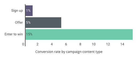
Sometimes, running a contest for your signup form isn’t practical. But that’s not the only type of incentive you can provide.
Other offers can increase your conversion rates five-fold compared to a straight ask.
Monetary offers usually work well. If you’re collecting email addresses, you can give new subscribers a discount off their next purchases for signing up.
If you are using signup forms to generate profits through subscriptions, for example, make sure your offer is attractive.
You need to learn how to create a highly effective value proposition. Then, you need to make sure that value proposition is clearly displayed on the landing page where you have the signup form.
4. Enable autocomplete
An autocomplete option simplifies the signup process for users on your website.
Chances are, you’re not the first person to ask them for the information you’re collecting in the signup form.
Depending on the visitor’s browser settings, this information can be stored. Once they start typing, the browser will recognize the required fields and automatically fill them out for the user.
However, this will work only if you enable the autofill feature when you’re programming the form fields on your site.
According to Google, users fill out forms 30% faster with autocomplete than without.
Speed is one of the reasons why you’d want to keep form fields as short as possible. If you have longer forms, the autocomplete feature will help improve your conversions.
Just make sure it’s easy to make changes in case the information provided by autofill needs to be corrected.
For example, a user may have multiple email addresses. They won’t want to use their work email address on your website if it’s for personal purposes. If the autofill adds the wrong email address, they should be able to correct it without the changes affecting the other form fields.
5. Allow social signups
Another way to speed up the signup process is by allowing social signups.
If you can integrate your website with social media platforms, users will be able to sign up with just a click or two.
Currently, 34% of retailers have this feature on their websites:
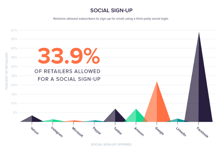
As you can see from this data, Facebook is the most popular social media site for signup form integration.
If you want to implement this on your website, follow the Facebook developer instructions.
Once you set this up, here’s an example of what your signup form will look like:
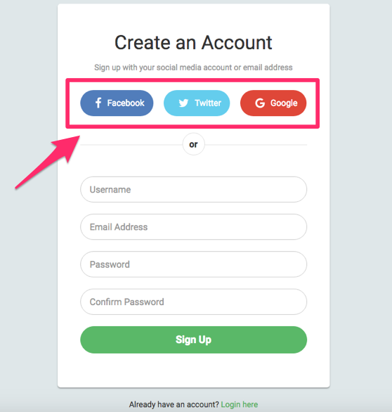
This is a relatively short signup form. It has only four form fields, which should make this form highly converting, given the information I shared with you earlier.
However, the process can be simplified even more for the user.
By clicking on one of the social icons I highlighted, they will sign up with just one click if they are already logged into one of those profiles.
If they’re not logged in, they’ll be redirected to a page that requires their username and password for the corresponding account.
Either way, this is still faster than filling out a signup form, no matter how short.
6. Avoid CAPTCHAs
CAPTCHA is short for “completely automated public Turing test to tell computers and humans apart.”
In short, this technology is used to distinguish between an action completed on a website by an actual person and a computer.
I’m sure you’ve seen these before. It’s one of those steps you have to take to verify you’re not a robot.
Here’s an example of what a CAPTCHA function looks like on a signup form:
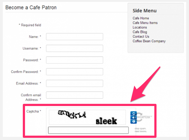
Businesses implement this feature to detect bots and avoid spam.
However, it ends up being an extra step for users.
I’m willing to bet you have had to complete similar CAPTCHA forms multiple times in order to proceed with something. It’s annoying, especially since you’re obviously not a robot.
In addition to this being an extra step for people to complete, it’s also very frustrating if they get it wrong.
After a couple of attempts, they may decide to just abandon the signup process completely, which will obviously hurt your conversions.
You’re better off running the risk of some bots or spam on your website than turning prospective customers away with a CAPTCHA form.
7. Focus on opt-in placement
Where is your signup form located on your website?
In some instances, the form will appear on multiple locations on different landing pages.
Depending on your business, a signup form won’t always be your priority. For example, if you have an ecommerce shop, you’d rather prioritize sales than email signups.
The most common place for an email signup opt-in is in the footer of a website:
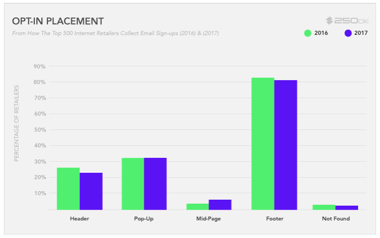
But it doesn’t mean it’s the ideal location.
If you rely on this signup form to drive revenue, you’ll want to make this the focal point of your landing pages.
Try including a signup form in the sidebar of your blog posts. You can even have them appear as popup windows when someone clicks a specific CTA on your website.
The point is, there isn’t an exact winning placement that’s the same for every business and all of their landing pages.
It’s up to you to determine your priorities and then choose the location of your signup form accordingly.
8. A/B test your CTA
If you’ve never run an A/B test before, I highly recommend reading my guide on everything you need to know before you start A/B testing.
Signup form CTAs are the perfect candidate for these types of experiments.
You can test many different elements of a CTA, such as its:
- size
- placement
- color
- font
- wording
Making subtle changes can have a major impact on your conversions. Just make sure you’re testing only one element at a time.
Once you complete your A/B tests, you can be confident that your signup form CTA is optimized for high conversions.
9. Highlight incomplete information
I briefly talked about this earlier when comparing forms with one column or two.
A user may leave a required field incomplete. If this happens, you want to make sure it’s corrected as fast and as efficiently as possible.
This user obviously wants to convert. They filled out some information and clicked your CTA.
Don’t let them get away without completing the process.
If they click on your CTA and nothing happens, they may just assume there is a problem with your website. That’s why you need to clearly highlight incomplete fields.
Here’s an example from the ClassPass website:
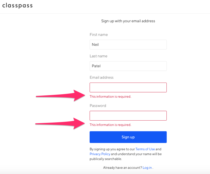
As you can see, I only filled out my first and last name on this form. I didn’t enter an email address or password.
Once I clicked the “Sign up” button, the email address and password boxes both turned red with an alert saying “This information is required.”
Without this type of alert, someone who made an honest mistake may not understand why they can’t submit their form.
The example above is very simple. It’s pretty obvious which fields were left blank.
However, that’s not always the case with longer signup forms. Don’t make users go back and hunt for what’s wrong. Highlight the error for them so it’s clear.
10. Showcase social proof
Your business should be looking for unique ways to effectively use social proof to increase conversions.
Signup forms are a great opportunity for you to do this.
The whole idea behind the concept of social proof is that people are influenced by others. If you can show your website visitors that other people have benefited from what you’re offering, they will be more likely to convert.
Integrating your social proof strategy with your signup forms is ideal because it’s going to be visible when people are making their decisions.
Here’s an example of how Single Grain used this strategy on its signup form:
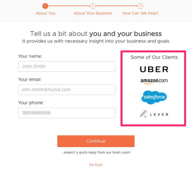
The company is showcasing some of its top clients.
If major corporations such as Uber, Amazon, and Salesforce have benefited from its services, it must be good, right? That’s what people think when they see this type of social proof.
That’s not the only way to approach it.
You can use statistics that highlight an expert’s opinion. Say something like, “95% of doctors recommend XYZ.”
Just make sure it’s accurate.
You can also use a celebrity endorsement to create social proof.
Create proof in numbers as well. If 750,000 other people signed up, it will encourage others to do the same. Have a running tally of the number of customers or email addresses you’ve collected next to your signup form.
It’s also just as effective to include customer testimonials on these landing pages.
11. Use sentence case
It may not seem like a big deal, but typography can impact conversions.
You need to make sure your signup forms are easy to read. I see this often in my consulting work.
All too often, I see companies misuse capital letters. They do this to emphasize some information, but it doesn’t come off that way.
Just look at the difference between sentence case and all caps:

Today, people associate all capital letters with yelling. You don’t want to come across as if you’re yelling at your website visitors.
Sentence case looks cleaner, and it’s more conversational.
If you scroll back up and look at the examples above, you’ll notice the majority of the content is sentence case.
In some instances, you can get away with using title case. But I would always avoid using all capital letters. This looks too unprofessional.
12. Eliminate distractions
I briefly talked about this earlier. Each page of your website should have a priority.
Once that priority has been established, it should be the focal point of your landing page.
Don’t try to encourage people to sign up for something while simultaneously promoting your newest product and playing an embedded video about your company culture at the same time.
It’s too complex, and the website visitor won’t know where to focus their attention.
By eliminating distractions, you will focus the user’s attention on converting. Here’s a great example of a simple landing page from the Free Conference Call website:

Nothing else is happening on the screen except for the invitation to sign up and create an account.
Yes, the page has a background image. But that’s fine.
This type of image is much more appealing than just a plain black or white background.
Plus, the image is positioned perfectly. Both of the subjects in the background are looking in the direction of the signup form.
It’s only natural for you to follow their eyes toward the form.
By limiting text and prioritizing the form on the screen, you will increase conversions.
Conclusion
Adding signup forms to your website doesn’t guarantee your traffic will convert.
Whether you’re creating a new signup form or trying to improve an existing one, you can make changes that will increase conversions.
Use this list as a reference to help you through this process.
If you apply the tips I’ve outlined above, your signup forms will turn into conversion machines.
What tips is your website using to increase conversion rates on your signup forms?
Source Quick Sprout https://ift.tt/2DX80gU

ليست هناك تعليقات:
إرسال تعليق