As an ecommerce store, driving traffic to your website is only half of the battle. That in itself is a tall task, but so much more needs to be done in order for you to actually generate sales.
Take a moment to put yourself into the minds of the consumers.
Clearly, they’re somewhat interested in whatever you’re selling. Maybe they found you from an organic search of a product they need or maybe they clicked on a PPC advertisement. It’s possible that they found your site from a social media campaign.
The way they found you really doesn’t matter. What’s important is that they landed on your site because of interest.
You’ve done a great job of setting up your site navigation, making it easy for visitors to find exactly what they’re looking for. This brings them to the product page, which is what we’ll be focusing on in this guide.
Here’s what you need to realize. When a website visitor lands on your product page, they’re often just a click away from completing the purchase process. But that won’t happen if those landing pages aren’t optimized for conversions.
Failure to properly design and optimize product pages is a mistake that I see ecommerce sites make all of the time. That’s what inspired me to write this guide.
I’ll explain everything you need to know about crafting product pages that drive conversions.
Elements of a product page
Before we continue, I want to make sure you understand exactly what needs to be included on every product page. All product pages should have the same elements.
- The Product
- Branding
- Design
- Copywriting
First and foremost, your product always needs to be the center of attention. While this may seem obvious, I’ve seen some ecommerce sites position their products in a way that appears to be an afterthought.
Branding needs to be everywhere on your website. While you may have branding on your homepage or other interior pages, you can’t forget to add this to your product pages. Depending on where your traffic is coming from, not everyone who lands on a product page will see your homepage.
Website design is one of the most crucial elements of a product page. Even if you include all of the other proper elements, it’s useless if the design isn’t functional or user-friendly.
You can’t sell products without text. That’s why your sales copy is a critical element. The writing needs to flow well with your design and branding to tie everything together.
Now that you know what needs to be on your product pages, let’s look at some more specific tips for product page optimization.
Make sure your CTA is clear and obvious
How does someone buy an item from your product page?
They need to click on a button that allows them to check out. But if that button is buried somewhere on the page, you won’t drive as many conversions.
Take a look at this product page from Blenders Eyewear.
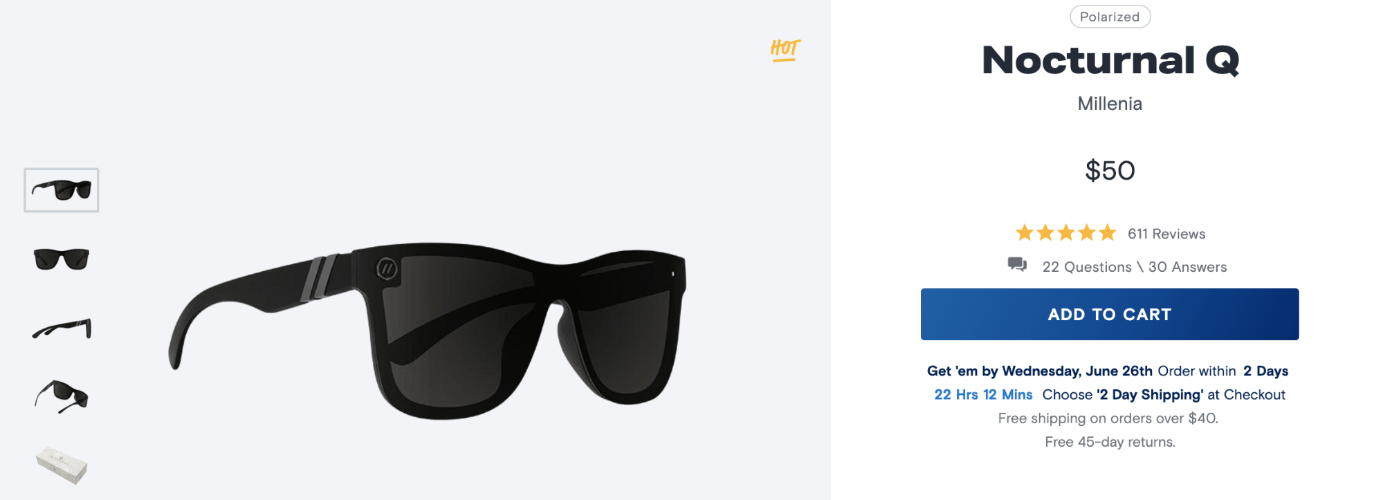
There’s only one button on this entire page that can be clicked—add to cart.
It’s big, bold, and the only text on the screen with a background color. In fact, aside from the product itself, the CTA here is the most prominent part of the page. It can’t be missed.
Go to your website and look at your product pages. See if your CTA is as clear and obvious as this one.
If your visitors can’t spot the button right away, it’s a problem.
Your CTA must be in view at all times. If users have to scroll to find it, then it’s not going to have a high conversion rate.
Here’s something else to keep in mind. Don’t place your conversion CTA near other CTAs on your site. For example, the “buy now” button shouldn’t be positioned next to a “subscribe” button.
While collecting emails is important, that doesn’t belong above the fold on your product page, and it certainly shouldn’t be somewhere that will draw attention away from your transactional CTA.
Don’t get too cute or fancy with the wording of your call-to-action either. Something along the lines of “buy now” or “add to cart” is just fine. Trying to be creative here can just end up confusing your customers.
Use professional photography
Unlike brick and mortar retail, online consumers rely heavily on images to make their buying decisions.
Your smartphone might take a great picture, but you should not be using it to take product photos. Everything needs to be handled by a professional.
Get a photographer to handle photoshoots with professional equipment and editing software. It’s worth it to spend extra on these things in order to get the best shot. You’ll need to take photos from every possible angle.
With that said, you also need to make sure that you’re taking the “right” photos for your product pages.
For example, let’s say you’re selling something like a wristwatch. A photo of a watch alone on a table doesn’t really add much value to the consumer. But if you put it on someone’s wrist, it gives them a better indication of the product will look if they buy it.
Take a look at the images on this product page from MVMT.
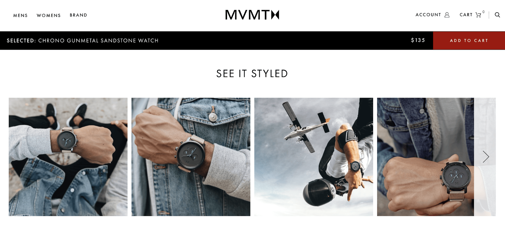
This is great photography. They used the “right” images because all of the shots show the product on a person’s wrist.
You can see how it looks from every angle. The first image shows how it looks from the first person perspective of the model looking down to check the time. Then it includes some other shots of how it will look from someone else’s view.
Oh yeah—they even show what the watch looks like if you’re jumping out of a plane.
These photos tell the full story about the product. It’s stylish, looks great, and can be worn as casual wear and active wear alike.
Include social proof
No matter how independent or unique a person claims to be, consumers will still follow the lead of others. Why should they buy a product if nobody else has?
They’ll have no way of telling if your product is good, useful, or just a waste of their money. If they’re unable to get these questions answered, then they probably won’t buy.
That’s why you need to include social proof on your product pages.
84% of people trust an online review as much as a recommendation from a friend. After reading between one and six reviews, 68% of customers form an opinion about a brand or product.
It’s your job to encourage customer reviews. After someone makes a purchase, send a follow-up email and ask them to rate or review the product. The more reviews you get, the better off you’ll be.
In fact, 49% of consumers say that they value the quantity of online reviews when they’re evaluating a business.
Blenders Eyewear, one of the examples we looked at earlier, had reviews on their product page. Just make sure you don’t let the reviews distract the user from buying.
Here’s another example of this strategy used by Brooks.
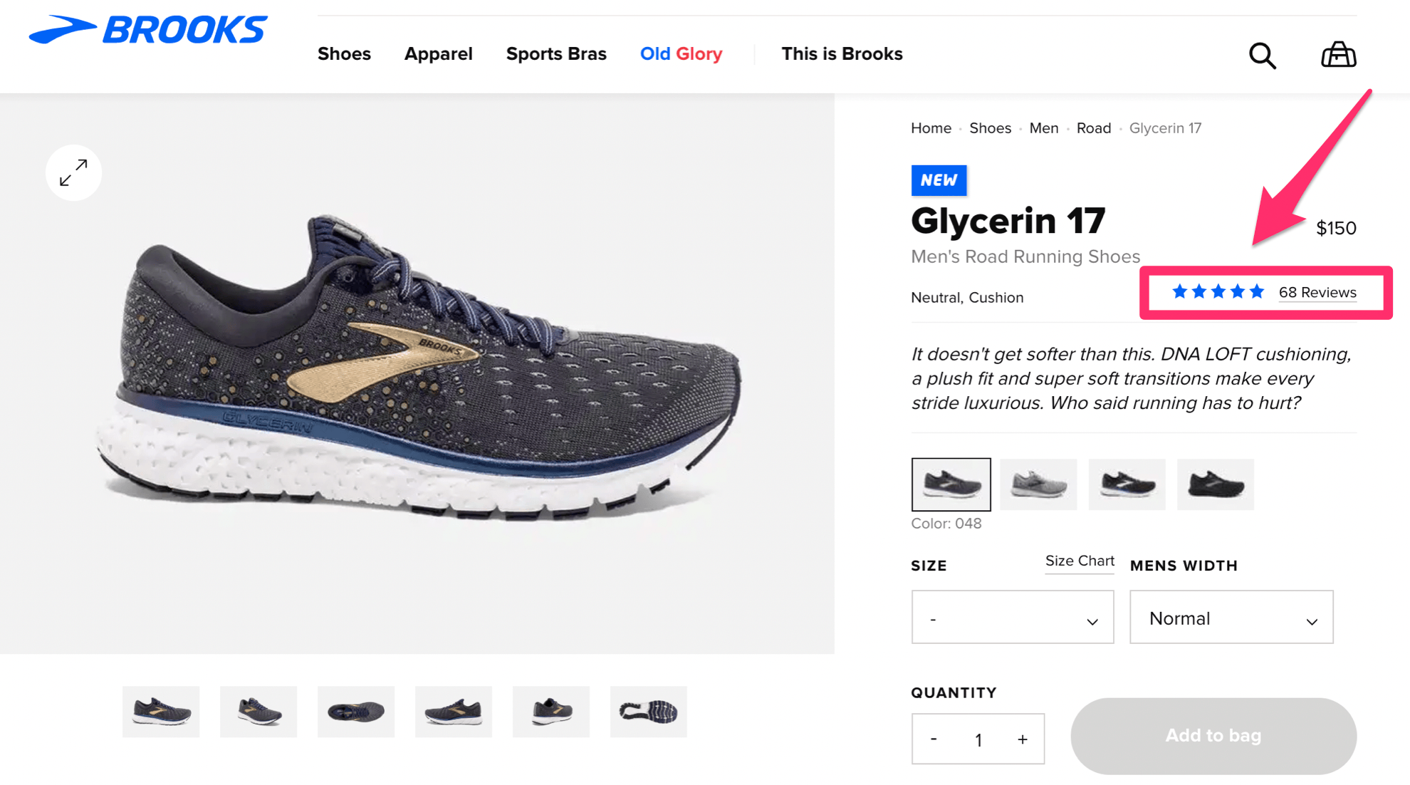
This product has 68 reviews and it’s rated 5/5 stars by their customers. You can see this information above the fold, and near the product description.
However, the actual reviews aren’t shown here. If you click on them, it will bring you to the bottom of the page.
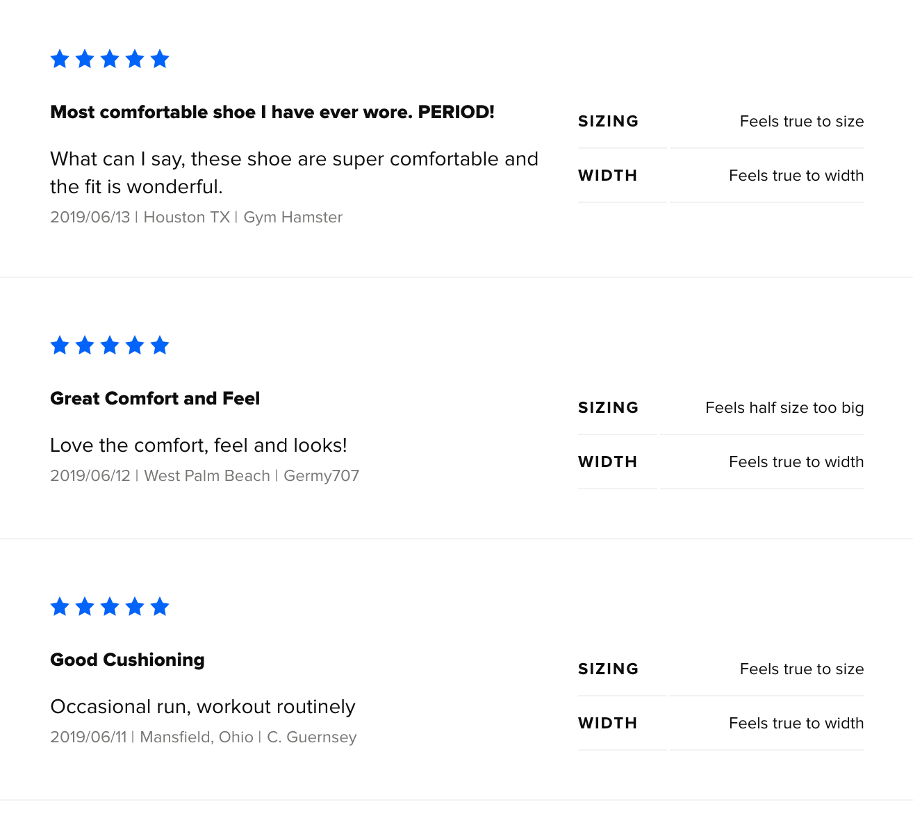
That’s where the reviews belong.
If these were positioned elsewhere on the page, it would be too distracting and take away from the product and CTA. But by including some information above the fold, and giving customers easy access to find the reviews and read them, it helps aid their buying decision.
Visitors can do all of this without having to go to another landing page or third-party review sites.
Add videos
If a picture is worth 1,000 words, how much is a video worth?
Earlier I explained the importance of allowing your customers to get a better understanding of your products with images. But a video really gives them a closer look at everything.
Videos can showcase your products more than a picture ever could.
In fact, 90% of people say that product videos are helpful during the buying process. 70% of marketers say that videos convert higher than any other type of content.
After watching a video, 64% of consumers are more likely to buy a product.
Check out this example of a product page from GoPro.
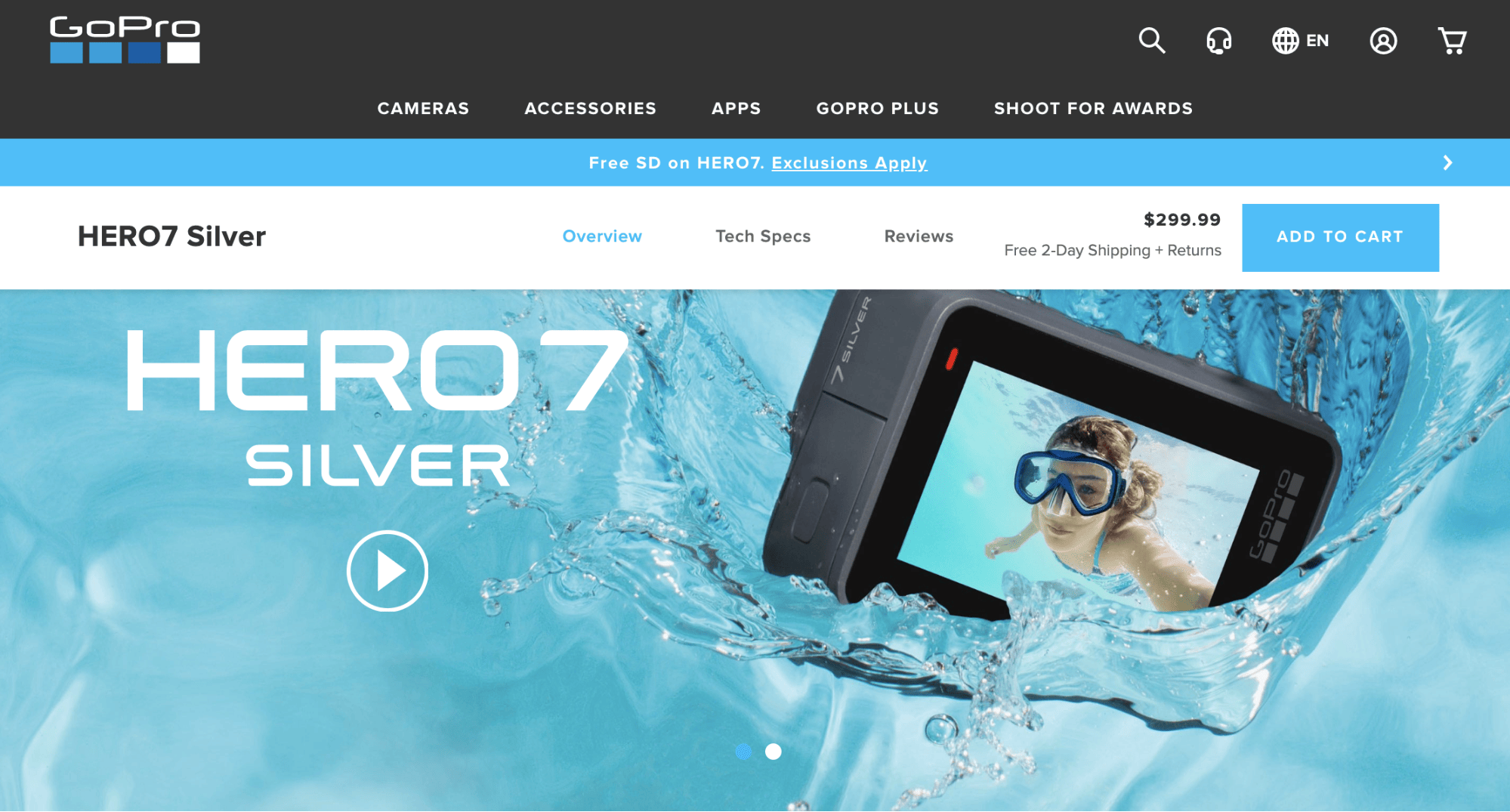
It’s a different approach compared to some of the other examples we’ve looked at so far.
Videos are especially important for this company since they’re selling a camera on this page. The video shows exactly what type of content can be captured with this camera.
Videos are great for those of you who have products that need a little bit more explanation. It’s not necessarily required if you’re selling something simple, like a plain shirt.
But with that said, you can still include videos, even if you’re selling something straightforward. Allbirds is a shoe company that has videos on their product pages of people walking in their shoes.
For those of you that have a product that’s a bit more complex and requires further explanation, adding a “how to” video or product demonstration can be very helpful to the consumer.
Carefully craft product descriptions
This is one of the more common mistakes that I see on ecommerce product pages. Everything looks great until the description.
While your product page should definitely be visually appealing with photos and videos, you still need to have some text on the page.
Keep it short. Don’t go overboard with long paragraphs. Nobody wants to read large blocks of text. You can use bullet points to shorten the content and make it easier for people to read.
Don’t be boring. Establish a brand voice. Know your audience and what they want to hear.
If your target market is business professionals over the age of 50, the description would be different then if you were trying to reach college students.
Look at this product description from Dr. Squatch, an ecommerce site that sells men’s soap.
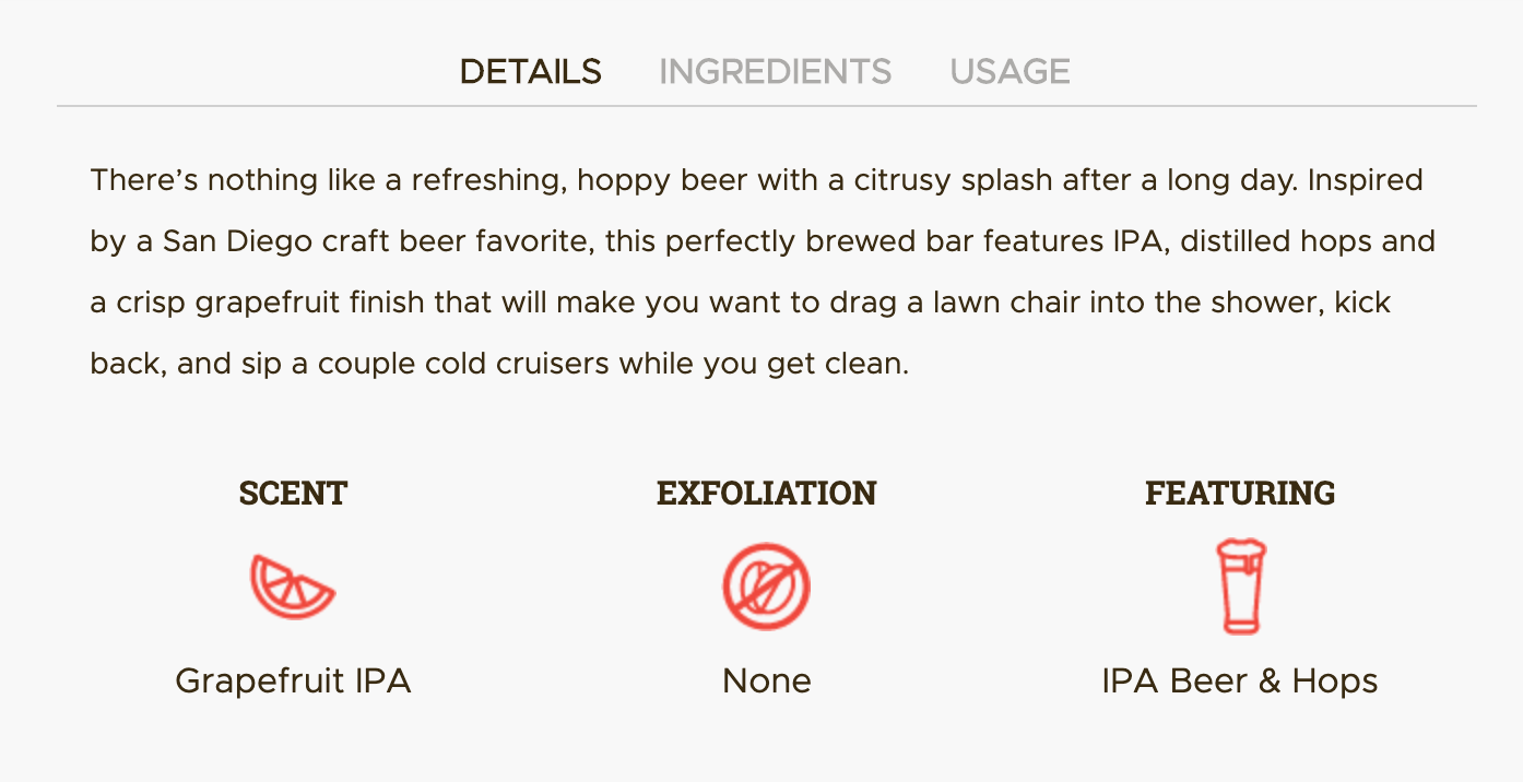
This particular bar of soap was inspired by the scent of beer.
Take a closer look at some of the text in this description. They use phrasing like “drag a lawn chair into the shower” and “sip a couple cold cruisers.”
Their product isn’t for everyone. So they’re comfortable using slang to target a specific market.
Normally, I’d say steer clear of this type of phrasing. But in this case, it’s part of the company’s overall branding strategy.
Understand your customer and what they want in a product. Then work that into the description.
Don’t just rush through the process and say “soap that smells like beer.” Does this describe the product? Sure.
But will it make anyone want to buy it? Probably not.
Justify your pricing
Your pricing strategy is part of your product page since the price will obviously need to be on display.
This is your chance to justify your pricing and show your product’s value.
The description, pictures, videos, and everything else on the page needs to explain exactly why your product is priced a certain way. This is especially true for those of you who are selling products at higher price points.
Look at this example from Lululemon.
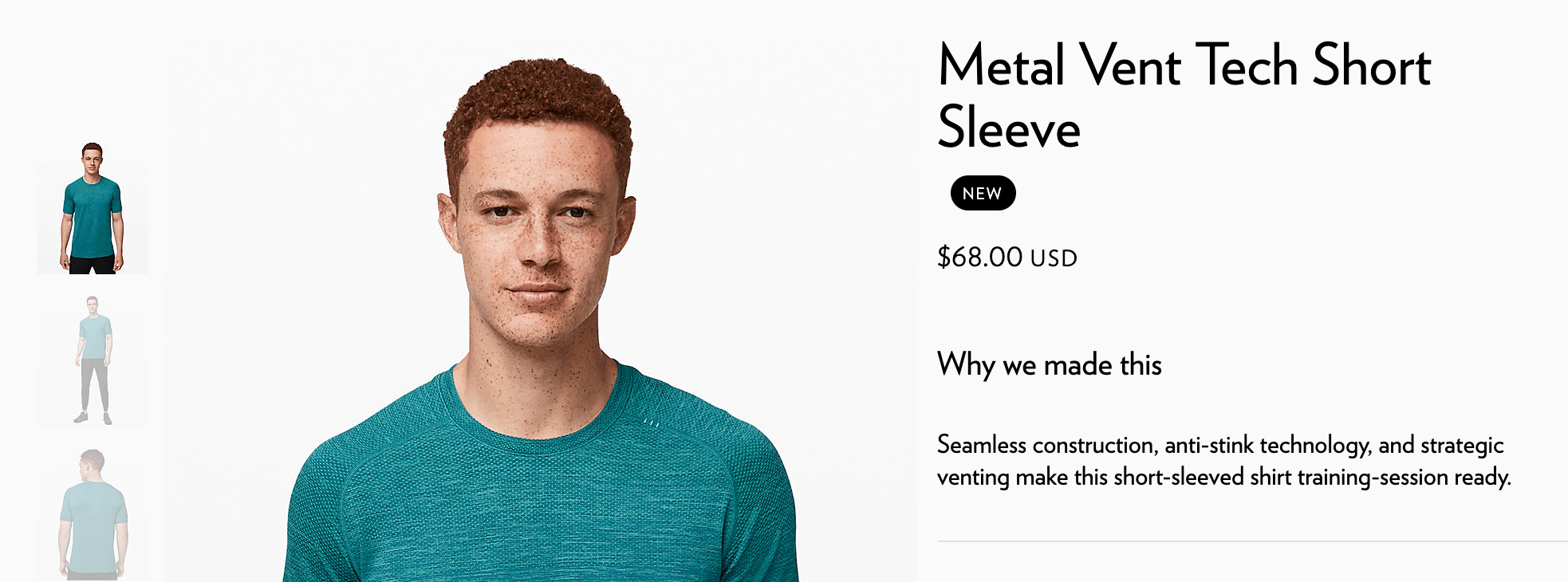
They have a quick “why we made this” description directly under the price.
In short, it explains that the product doesn’t have seams, is made with anti-stink technology, is ventilated, and made for training.
It’s not just a regular t-shirt for wearing to bed or around the house. So the high price tag of $68 for a seemingly simple shirt is justifiable.
Without that information, consumers may be a bit more reluctant to buy.
A/B test everything
Truthfully, you won’t know for sure if your product page is fully optimized until you try different approaches.
That’s why every element of the page should be A/B tested over and over again.
- CTA wording
- CTA placement
- CTA color
- Description
- Review placement
- Price placement
- Price size
The list goes on and on. It’s an ongoing process.
Even as your conversion rates rise, don’t assume that they can’t get any higher. Keep running tests to be sure.
Conclusion
Product pages are the most important components of your ecommerce site.
When a website visitor lands on one of these pages, they are moments away from converting. It’s your job to make sure that every product page is optimized to drive sales.
Use this guide as a reference to help you make sure that your pages have all of the crucial elements needed. Then follow the examples that I showed you and apply those same principles to your website.
Source Quick Sprout https://ift.tt/2YQO7zL

ليست هناك تعليقات:
إرسال تعليق